The largest technology ETF publishes its holdings every day. This week we scanned every one of them, most recently on Monday, September 21: 73 equities, 72 with enough price history to test. Ten are in a confirmed structural decline. Twelve sit within five percent of their highs. Sixteen are more than thirty percent below theirs.
Those three facts describe the same fund on the same morning, and none of them contradicts the others. That is the whole subject of this piece: what a sector looks like when its leaders are still leading and part of its base is quietly giving way, and what we can and cannot conclude from it. Behind it sits one question we care about most. If the fund pushes through its June high, is that strength, or the last stretch of an advance? On a chart the two look the same on the day. What separates them is what is underneath.
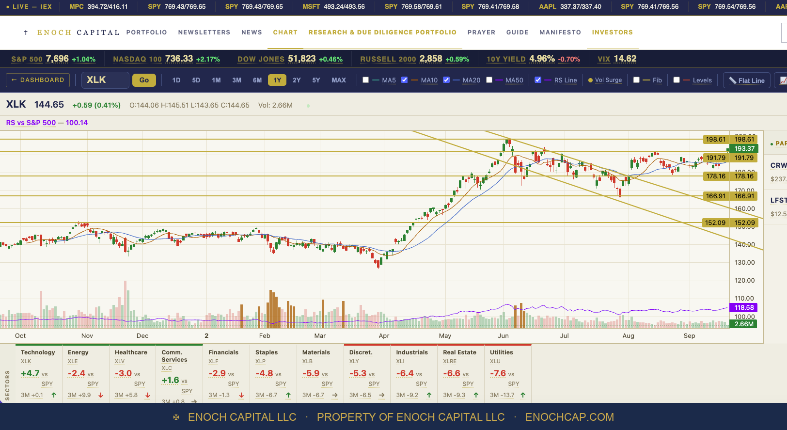
The sector fund itself closed the week at $193.37, two and a half percent under its June peak of $198.61. The chart below is the one we watch. The horizontal lines are levels we drew by hand from prior turning points: $198.61, $191.79, $178.16, $166.91 and $152.09. The two diagonals mark the descending channel that formed after June.
Read plainly, the chart says the sector is strong. Price is above its 10- and 20-day averages, it has climbed out of the channel, and its strength relative to the S&P 500 (the purple line at the bottom) is rising. On Monday the Nasdaq 100 was up more than two percent. Nobody looking at this chart would call it a market rolling over, and we do not. But an index can hold its level while the number of stocks carrying it shrinks, and price alone does not show that. Breadth does, and a chart at this point in its run raises a question the next section takes up.
The line we are watching hardest is not $178.16. It is $198.61, the June high, which the fund sits 2.6 percent under. A move through it is what a healthy advance looks like. It is also how the final stretch of an advance can look. On the day, the two are indistinguishable.
Start with how stretched the fund is. At $193 it sits 19.2 percent above its own 200-day average. Since 1999 it has been that far above it on about six percent of days. The peak was 38.2 percent, on March 27, 2000. At the June high itself, on June 2, it was 36.3 percent above, second only to that peak. Since then it has worked off some of the stretch by moving sideways rather than by falling, which is why today's reading is lower but the fund is barely below the same price.
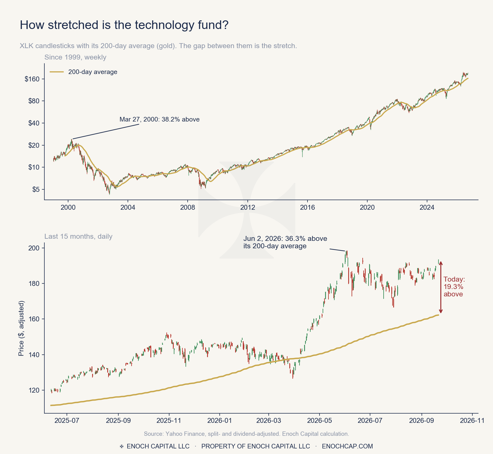
We then went looking for what has followed. We took every time since 1999 that the fund first climbed 15 percent or more above its 200-day average, counting each episode from its first day and keeping them at least three months apart. There are eleven. Six months later the fund was higher in ten of the eleven, and the one exception, in February 2011, was down 8.2 percent.
That result matters, and it cuts against a simple story. Being stretched has not, by itself, predicted a decline. In late 1999 the fund was well above its average and kept climbing for months before the top. What it has predicted is a rougher ride: in four of the eleven episodes the fund fell 8 percent or more at some point in the following six months, and once, from December 2019 into the pandemic sell-off, it fell more than 22 percent. Extension is a condition, not a signal. It means that when a drop comes, it starts from a long way up.
What we do not have is a comparable record of breadth for those eleven episodes, because our count is days old. That is the honest limit of what we can say. What we can do is watch it in real time, and it separates the two readings of a breakout:
Neither reading gives a date. The Oracle example below shows how long a signal can be early. But the second one is the reading that would change what we do, and we would rather say in advance what it looks like than explain it afterward.
For each of the 72 names we ask a specific, mechanical question borrowed from how Jesse Livermore read the tape: has the stock made a lower pivot high, and then another? A pivot high is the peak of a rally, confirmed after price has pulled back ten sessions on either side of it. A stock making higher peaks is being accumulated. A stock making two lower ones in a row is being distributed, however good the story around it sounds.
That is the same test our trading system uses on the long side, run in reverse. It is a strict test. It needs at least three confirmed peaks, and the last two must each be lower than the one before. A stock can be down forty percent and still not pass it, if its decline has been one long slide with no rally worth calling a peak.
On Monday, September 21, ten names passed: Intuit, Accenture, Cadence, IBM, Microchip, ON Semiconductor, Akamai, Flex, Ciena and Coherent. That is 10 of 72, or 14 percent. On Saturday it was 11. Cognizant dropped off the list when technology rallied on Monday, which is a reminder of how sensitive a strict test is to a single strong day, in either direction.
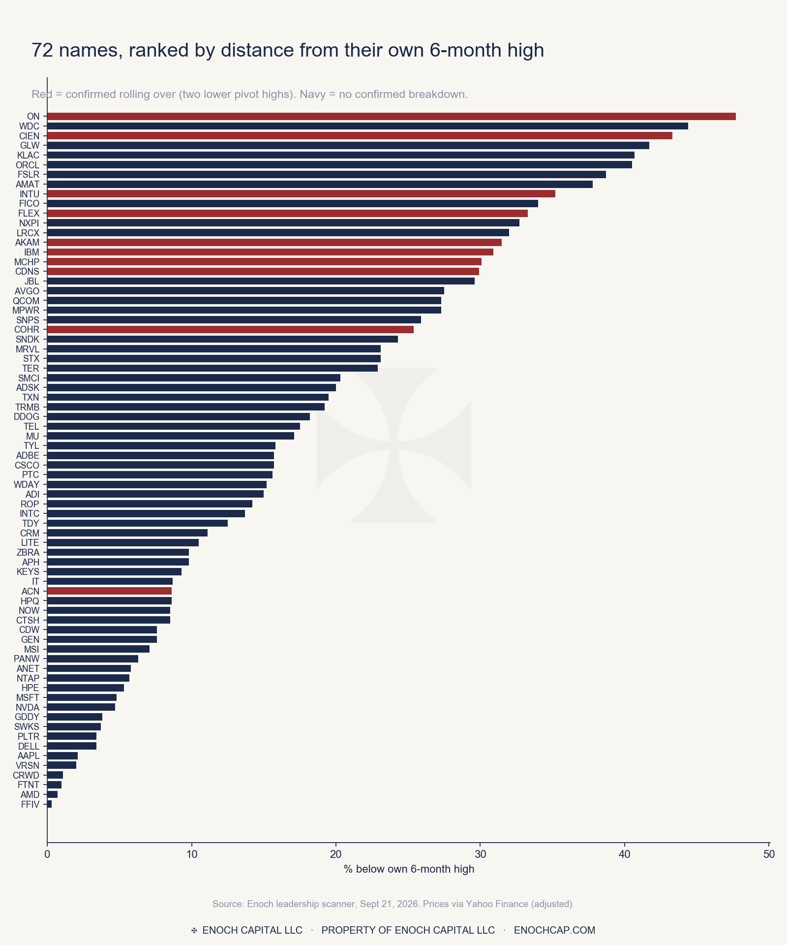
The chart shows how uneven the picture is. At the bottom, twelve names sit within five percent of a high: Apple, Microsoft, Nvidia, AMD, CrowdStrike and others. At the top, sixteen sit more than thirty percent below one. The average name is 18.3 percent under its high, and the median name has risen 22.6 percent over twelve months. Twenty-five of the 72 are lower than they were a year ago; sixteen have more than doubled.
The first time we ran this scan, on Saturday morning, we used the 25 largest holdings. It came back at 4 percent: one name in 25 confirmed rolling over. We wrote it down.
Then we checked the fund's own daily holdings file, published by State Street, and found we were looking at 25 of 76 positions. The full list is 76 lines, 73 of them tradable equities. We rebuilt the basket and ran it again. The answer was 11 of 72, or 15 percent.
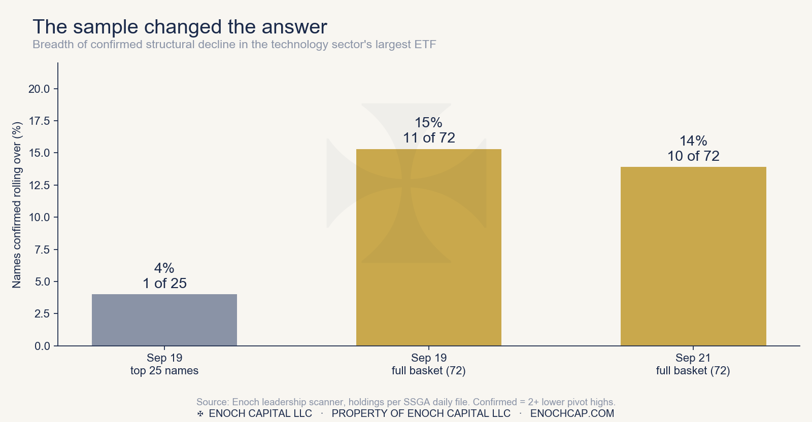
We are showing this because it matters more than either number. The smaller sample was not wrong about the names it contained. It was wrong about the fund, because the largest positions are the ones most likely to be intact, which is partly why they became the largest. Anyone reading breadth from a fund's top twenty-five is reading its strongest stocks and calling it the whole.
It also means the number to compare against, going forward, is the full-basket reading. Our log has two of those so far. A trend needs more, and we will not pretend two points make one.
When we sorted the same 72 names a different way, a pattern appeared that the breadth number hides.
Roughly speaking, the fund holds two different kinds of company: software and services on one side, hardware, semiconductors and networking on the other. Grouping them by hand, which involves a few judgment calls, the 27 software and services names have a median twelve-month change of negative 20 percent. The 45 hardware, semiconductor and networking names have a median of positive 48 percent.
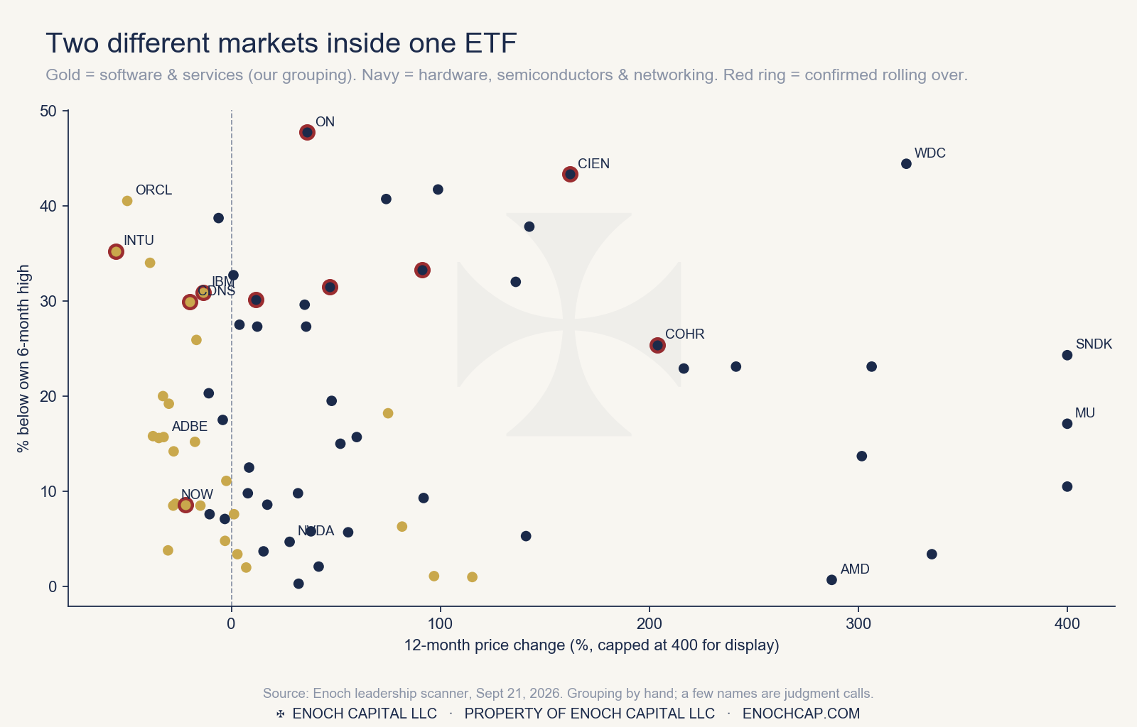
The leaders are extraordinary. SanDisk is up about 1,700 percent over twelve months, Micron more than 500, Lumentum more than 460, Dell more than 335. At the other end, Intuit is down 55 percent and Oracle down 50. Those are two very different stories sharing one ticker symbol.
The confirmed rollovers are not confined to either side. Four of the ten are software and services; six are hardware. That is the part we find most worth watching: the strain is not only in the slower-growing corner. Ciena, Coherent, ON Semiconductor and Flex are each more than a quarter below their highs.
Oracle is the case that started this. Its business has been widely discussed in the financial press, and we want to be careful to separate what we measured from what others reported.
What has been reported, and what we have not independently verified: Michael Burry disclosed a short position in Oracle in early 2026, arguing that its debt-funded data center build-out and the depreciation schedules used across the industry overstate profits. S&P lowered Oracle's credit rating to BBB-, one notch above speculative grade, on July 9, citing the borrowing. Company reports of layoffs during the build-out were carried in the press as well.
What we measured, from price alone: on February 2 and 3, Oracle's chart satisfied every structural gate our system uses for a decline. Its rallies had weakened, it had made confirmed lower pivot highs at roughly $322, $225 and $208, it was well below its six-month high, and it broke support on heavy volume. It was near $160 on the day.
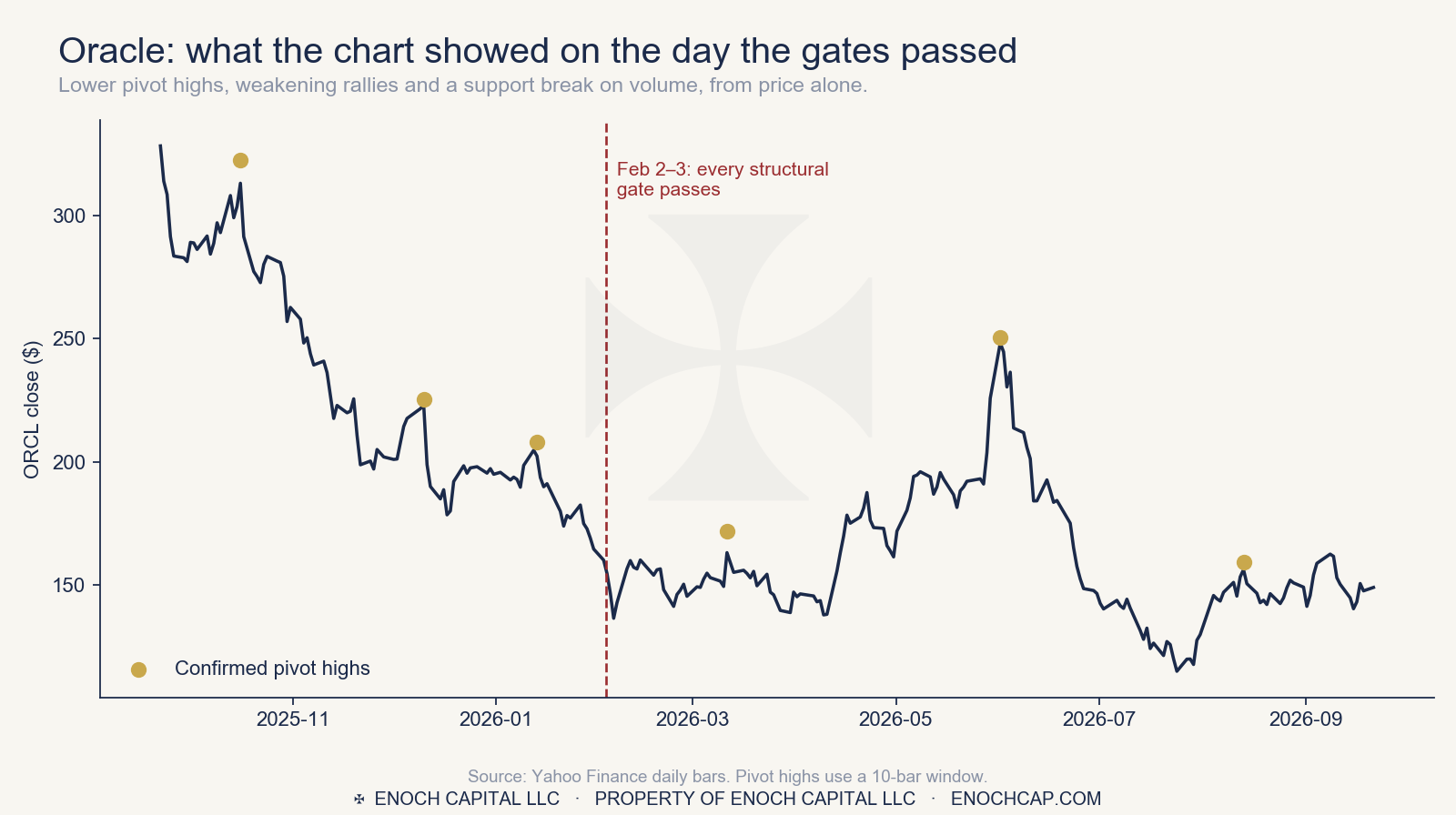
Here is the part we want the reader to see clearly. The gates were right about direction and early about the sequence. Oracle did not keep falling. It rose from that level to about $250 by June, a gain of more than fifty percent, before falling back to roughly where it started. Anyone acting on the signal in February would have sat through a large rally against them. The signal was informative about the structure and silent about the timing.
That is a fair description of what this kind of test offers. It identifies a chart where sellers have taken control of the rallies. It does not tell you how long that control takes to show up in price, and it cannot tell you when it will be interrupted.
A chart says where a stock is weak. It does not say why, and it cannot tell a company under financial strain from one that is simply out of favor. So we pulled the latest annual reports of the ten rollover names, and Oracle, from the SEC's own filing database, and put three questions to each: how fast is capital spending growing against revenue, is free cash flow positive, and is the company borrowing to pay for it.
Nine of the ten confirmed rollovers are profitable, cash-generative businesses. Free cash flow was positive in the latest fiscal year for every one of them, from $12.1 billion at IBM, $10.9 billion at Accenture and $8.7 billion at Intuit down to $0.7 billion at Ciena. Wherever we could compute it, capital spending runs about six percent of revenue or less. Whatever is pulling those charts down, the filings do not show a balance sheet under strain.
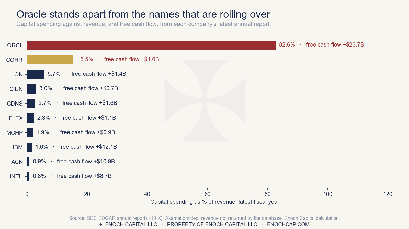
Oracle is the clear exception. Across its last three fiscal years its capital spending went from $6.9 billion to $21.2 billion to $55.7 billion, or from 13 percent of revenue to 37 to 83 percent. Free cash flow went from positive $11.8 billion to negative $23.7 billion. This is the pattern we look for when a company is borrowing to build faster than its business can pay for: spending far ahead of revenue, and cash flow turning negative.
Coherent shows a milder and earlier version. Its capital spending rose from 7.4 percent of revenue to 7.6 percent to 15.5 percent in its latest year, and operating cash flow fell from $0.63 billion to $0.08 billion while revenue grew 23 percent, leaving free cash flow at negative $1.0 billion. Its debt is modest at $3.2 billion, down from $4.1 billion two years earlier, and it reported $0.8 billion of net income, though that includes a gain of $0.12 billion on the sale of a business. But $0.08 billion of operating cash flow is thin against $3.2 billion of debt and $1.1 billion of spending. After Oracle, it is the one name where the debt lens raises a question. We would call it early and worth following, not distress, and we have not traced how the spending was funded.
Two others look more like a cycle than a strain. Microchip's revenue fell from $7.6 billion to $4.4 billion before edging back to $4.7 billion. ON Semiconductor's fell from $8.3 billion to $6.0 billion while it cut capital spending from 19 percent of revenue to 6 percent. In our reading those are the marks of a semiconductor downturn, not of a buildout paid for with debt.
Intuit shows the opposite of strain. Revenue is up 32 percent over two years, net income up 54 percent, free cash flow is $8.7 billion, and the stock is down 55 percent over twelve months. The filings show a growing, cash-rich company. Whatever the market is pricing, it is an expectation about the future and not something visible in these reports.
We also ran each profile through Veritas, our library of sourced precedents for financing stress and distress. Oracle matches the live financing-stress case already on file for it, and CoreWeave's, the closest comparison. None of the other ten produced a match to a financing-stress precedent. Veritas also makes the distinction we want the reader to keep: a company with heavy capital spending and a strong balance sheet is an exposure, not a distress.
The debt, the way Michael Burry read it
Capital spending and cash flow show the strain. Burry's case on Oracle, as reported in the press, was about the debt underneath it, and whether new revenue can grow fast enough to carry it. So we read Oracle's filings that way, including the quarter ended August 31, which is already on file.
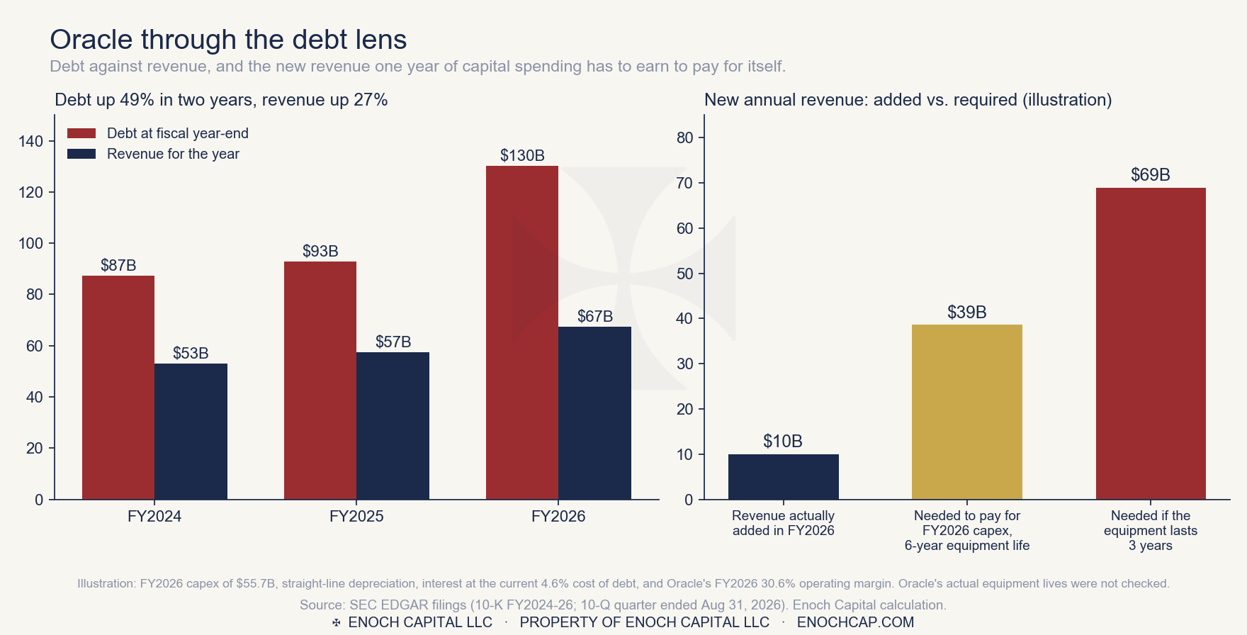
Then the question that matters: can new revenue overcome the debt? Take fiscal 2026's $55.7 billion of spending and assume it is depreciated over six years, financed at the current 4.6 percent cost of debt, and earns Oracle's 30.6 percent operating margin. On those assumptions it needs about $39 billion of new annual revenue to pay for itself. Oracle added $10 billion of revenue in the year. If the equipment wears out in three years instead of six, which is the heart of Burry's argument about industry depreciation, the requirement is about $69 billion. That is arithmetic, not a forecast, and the six-year life is our assumption.
The counterweight is the backlog. Oracle's contracted revenue not yet recognized stood at $664 billion on August 31, up from $638 billion in May, more than five times its debt. That backlog is what the whole bet rests on, and it converts to revenue only as the equipment is built and the customers keep paying. Press reports put roughly half of it with a single customer, OpenAI, which we have not verified. Its filings also show $34.2 billion of purchase commitments that do not yet appear on the balance sheet.
Across the rest of the ten, the debt is unremarkable against what they earn in cash. Latest reported debt runs from under one year of operating cash flow at Intuit to about two and a half at ON, three at Flex, four at Ciena, and 5.6 at Microchip, the highest of the group and the one to watch in its downturn. IBM's $56 billion is 4.3 times operating cash flow, and includes debt held against its financing business. Accenture, Cadence and Akamai did not return usable debt figures from the database.
The limits are plain. Income and cash flow figures are from each company's latest annual report. For Oracle we also used the quarter ended August 31, and debt for the other names is the latest balance reported. We did not review the other names' quarterly results or hiring news, and the debt figures for Accenture, Cadence and Akamai did not come through the database's standard tags, so we do not quote them, and the interest and operating-income tags for the other names were not consistent enough across years to compare. Oracle's are.
What this changes for the breadth question is that the ten rollovers are two different things: mostly ordinary price weakness in healthy companies, and a small number where the numbers back the chart. A rollover in a healthy company can reverse on better news. One supported by the cash flow statement is less likely to.
It does not say the technology sector is rolling over. Sixty-two of 72 names show no confirmed breakdown, the fund itself is near its high, and relative strength against the S&P 500 is rising. On Monday the whole group rallied.
It does say the leadership is narrower and more divided than the index level suggests: a group of extraordinary winners, a base of companies quietly losing ground, and ten names in structural decline that are not all in the corner where the trouble was expected.
What it means in practice is what the system already does. Our trading rules carry a regime gate: when the S&P 500 is in a bear regime, the system holds cash, without exception. Friday's reading was a choppy regime, in which the system takes fewer positions and demands stronger relative strength. That is the answer to what we would do if this deepens. It is the same rule, applied earlier or later, and it does not depend on our opinion about any sector.
What would change our reading, in either direction:
We run this scan on the full basket and log every reading, with the date and the count. The value is in the sequence: a single week's number can be noise, while a line moving across many weeks describes something. We will publish the log as it grows.
Past breadth deterioration has preceded the tops of major indexes more than once, and the late 1990s are the case most often cited. We mention it for context and not as a forecast. Every cycle differs, a narrowing group can persist for a long time, and the Oracle chart above is a reminder of how far a signal can run before it is proved right or wrong.
We hold positions ourselves, and readers should know them. Enoch Capital's paper trading account currently holds CrowdStrike, a member of the basket, and a small short position in the technology sector fund itself. The short was opened on Monday as a test of order execution on the account, sized at five percent of the account with a defined stop, and is not a forecast. These are paper positions; no client capital is involved.
Enoch Capital LLC · 2121 S. Broadway, #511, Denver CO 80210
Educational content only. Not investment advice. Publisher's Exemption (Lowe v. SEC, 472 U.S. 181, 1985). Enoch Capital LLC is not a registered investment adviser. Prices from Yahoo Finance and Alpaca; fund holdings from the State Street SPDR daily holdings file; company financials from annual reports filed with the SEC (EDGAR). Reports about Oracle, Michael Burry and credit-rating actions are press-sourced and were not independently verified by Enoch Capital. Past performance does not guarantee future results.